Improving the Field UI in Drupal 7
Drupal 7 consumed the widely used Content Construction Kit (CCK) module, which over its lifetime became the default way to build custom content types in Drupal. The result of this autophagy is the core Field module, which provides the tools to generate content types with custom fields and custom behavior for those fields. (Mentioned as an aside: there is still a CCK module release for Drupal 7. It provides some of the features that didn't make the final cut, such as the ability to specify a PHP function that will provide the options appearing in a node form select element).
The Field UI module provides an administrative user interface to the Field module functionality that works well for the basics, but any earnest use of fields will quickly run into its limitations. Suppose, for example, that you are working on a project wherein the node entity portion of the data model is described by a few dozen content types, a hundred or so different field definitions, and more than two hundred field instances spread across those content types. This is not unreasonable once you start thinking about the sort of Drupal site that supports the Economist, for example, or other similar business initiatives. Your data model will invariably evolve as the project progresses, and a great deal of the administrative work flow is defined, or at least channeled, by the settings in those few hundred field instances: which widget to use, the messages displayed to the user, which fields are required, how many values are permitted, and so on. The list of configurations becomes very long for the more complex field types provided by contributed modules, such as video uploads or file library selectors.
So you will find yourself pulling up content type field lists in the adminstrative user interface and cursing the fact that you can't see at a glance what the common field settings are. Is instance A of field X in content type R set to required, or was that instance B in content type S? Which content types are permitted for node reference field Y? Are all of the configuration values for the fifteen instances of field Z actually up to date for the recently proposed administrative UI changes? Finding the answers is at the least another few page loads, and when you multiply that by the number of times you need to ask these questions in the course of development, it turns into both a real annoyance and time sink.
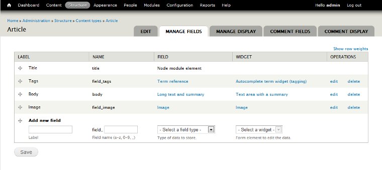
The fix for this issue is to add more information to each row in the fields summary form table - but this is complicated by the fact that the table has draggable rows:

So we can't just, for example, simply add an extra informational row under each field row. That would quickly become a mess. That is unfortunate, because adding an extra line of information under each field entry is probably the best way to present a summary of configuration details. Adding an extra column for the configuration summary would just bloat the height of each row with a lot of unused whitespace in the other columns and make dragging operations less convenient. The table width is also already pretty full with content, so adding an extra column would probably wind up requiring horizontal scrolling on most reasonably-sized monitors.
Two viable approaches spring to mind.
1) Write a New Field Summary Page
At first glance, it seems as though it should be fairly straightforward to add an additional tab to the field UI and display a new presentation page. The tab-adding code would look something like this:
/**
 * Implements hook_menu().
 */
function field_ui_plus_menu() {
  $items = array();

  // Add an additional tab to the field UI pages. This code is cloned from
  // the field_ui_menu() implementation.

  // Ensure the following is not executed until field_bundles is working and
  // tables are updated. Needed to avoid errors on initial installation.
  if (defined('MAINTENANCE_MODE')) {
    return $items;
  }

  // Create the tab for all possible bundles.
  foreach (entity_get_info() as $entity_type => $entity_info) {
    if ($entity_info['fieldable'] && $entity_type = 'node') {
      foreach ($entity_info['bundles'] as $bundle_name => $bundle_info) {
        if (isset($bundle_info['admin'])) {
          // Extract path information from the bundle.
          $path = $bundle_info['admin']['path'];
          if (isset($bundle_info['admin']['bundle argument'])) {
            $bundle_arg = $bundle_info['admin']['bundle argument'];
          }
          else {
            $bundle_arg = $bundle_name;
          }

          // Extract access information, providing defaults.
          $access = array_intersect_key(
            $bundle_info['admin'],
            drupal_map_assoc(array('access callback', 'access arguments'))
          );
          $access += array(
            'access callback' => 'user_access',
            'access arguments' => array('administer site configuration'),
          );

          $items["$path/summary"] = array(
            'title' => 'Fields summary',
            'page callback' => 'drupal_get_form',
            'page arguments' => array(
              'field_ui_plus_field_overview_form',
              $entity_type,
              $bundle_arg,
            ),
            'type' => MENU_LOCAL_TASK,
            'weight' => 3,
          ) + $access;
        }
      }
    }
  }

  return $items;
}

/**
 * Implements hook_menu_alter().
 */
function field_ui_plus_menu_alter(&$items) {
  if (module_exists('comment')) {
    // This is taken from comment_menu_alter(), and repeats the existing
    // behavior for other comment-related tabs.
    $base = 'admin/structure/types/manage/%comment_node_type/comment';
    $items[$base . '/summary']['title'] = 'Comment fields summary';
    $items[$base . '/summary']['weight'] = 6;

    // And adjust the other items weights to fall into line.
    $items[$base . '/fields']['weight'] = 4;
    $items[$base . '/display']['weight'] = 5;
  }
}
You could then try cloning the existing field UI form, remove the drag and drop functionality, and add an additional row after each field row to display the desired information. You might start with this stub form constructor to see what it looks like:
/**
 * Form constructor for the configuration summary version of the 'Manage
 * fields' form page.
 */
function field_ui_plus_field_overview_form($form, &$form_state, $entity_type, $bundle) {
  // Start with the existing form as a basis.
  module_load_include('inc', 'field_ui', 'field_ui.admin');
  $form = field_ui_field_overview_form($form, $form_state, $entity_type, $bundle);

  // Remove tabledrag.
  unset($form['#attached']['drupal_add_tabledrag']);

  // Make sure the form validates and submits to the right place.
  $form['#validate'] = 'field_ui_field_overview_form_validate';
  $form['#submit'] = 'field_ui_field_overview_form_submit';

  return $form;
}
This will display the raw weights and parent association selects, as is usually the case when table Javascript is disabled. What you'll quickly find out is that the weight and parent columns tie into field_ui_table_pre_render() - you can't just remove them without also thinking carefully about how the form submit and rendering work in this case. That makes this a somewhat harder job than it at first appeared if you want to leverage the existing Field UI form code.
As an alternative you could, of course, build your own non-form page callback to display a simple table of configuration information, and add it as a tab to the content type information pages. I'd rather put all that to one side and talk about the second option, however.
2) Clever Use of CSS and the Label Column
We can use an implementation of hook_form_FORM_ID_alter() to change the output of the existing field summary form in arbitrary ways. For example, we could add a whole range of configuration summary information for each field to the label column, replacing this:
<td>Title of my field</td>
With this:
<td>
  <div class="field-title-text">Title of my field</div>
  <div class="field-info"> ... arbitrary HTML ... </div>
</td>
This sort of approach will not disrupt drag and drop operations, and we can use suitable CSS to make the field-info div appear as though it were an additional row in the table. To achieve this the div has to (a) push down the height of the first table cell in each field row (and thus all cells in that row), (b) overflow the cell border on the right and remain visible, (c) interact correctly with potential text wrapping in rows to the right, so that there is no text overlap or obscurement, and (d) not disrupt the drag and drop styling. As you might imagine, that requires some tinkering.
The actual hook_form_FORM_ID_alter() implementation is more straightforward. We can set things up to invoke a hook, and thus any module with something to add can add it:
/**
 * Implements hook_form_FORM_ID_alter().
 */
function field_ui_plus_form_field_ui_field_overview_form_alter(&$form, &$form_state) {
  // Obtain the field instances for the entity examined here, and then loop
  // through to obtain the extra data to be added.
  // e.g. #entity_type = 'node', #bundle = 'page'
  $instances = field_info_instances($form['#entity_type'], $form['#bundle']);
  $fields = field_info_fields();
  foreach ($instances as $field_name => $instance) {
    // Obtain the data to be added.
    $data = module_invoke_all('field_ui_plus_instance_data', $instance);
    // Allow an opportunity to alter that data.
    drupal_alter('field_ui_plus', $data);

    // Replace the label markup in its cell with the themed data.
    $form['fields'][$field_name]['label']['#markup'] = theme(
      'field_ui_plus_data',
      array(
        'label' => $form['fields'][$field_name]['label']['#markup'],
        'data' => $data,
      )
    );
  }

  // Lastly, don't forget the CSS used to style the additions.
  $path = drupal_get_path('module', 'field_ui_plus') . '/field_ui_plus.css';
  $form['#attached']['css'][] = $path;
}
The hook_field_ui_plus_instance_data() implementations would look something like the following example, which returns a render array for display if a field instance is required:
/**
 * Implements hook_field_ui_plus().
 */
function field_ui_plus_field_ui_plus_instance_data($instance) {
  $data = array();

  // Is this field instance required?
  if (!empty($instance['required'])) {
    $data['required'] = array(
      '#type' => 'html_tag',
      '#tag' => 'div',
      '#value' => t('Required'),
      '#attributes' => array(
        '#class' => array('field-ui-plus-required'),
      ),
      '#weight' => 0,
    );
  }

  return $data;
}
Since the hook returns an array of render elements, the theming can be fairly straightforward - just a matter of wrapping the rendered output in whatever is needed to make the CSS magic happen:
/**
 * Implements hook_theme().
 */
function field_ui_plus_theme() {
  $items = array();
  $items['field_ui_plus_instance_data'] = array(
    'variables' => array(
      'label' => NULL,
      'data' => array(),
    ),
  );
  return $items;
}

/**
 * Theme the information for a given instance.
 */
function theme_field_ui_plus_instance_data($variables) {
  $output = '';
  $output .= '' . $variables['label'] . '';
  $output .= '';

  $output .= drupal_render($variables['data']);

  $output .= '';
  $output .= '';
  return $output;
}
Now on to the CSS. This is a first pass that gives you a single non-wrapping line of space in which to add text descriptions or icons representing the field instance configuration:
/*-------------------------------------------------------
  Alter the existing field instance table CSS.
 -------------------------------------------------------*/

table.field-ui-overview td {
  padding-top: 8px;
  position: relative;
  vertical-align: top;
}

table.field-ui-overview span.tabledrag-changed {
  float: left;
  margin-left: 4px;
}

/*-------------------------------------------------------
  CSS to structure the new field instance data.
 -------------------------------------------------------*/

.field-ui-plus-wrapper {
  float: left;
  height: 40px;
}

.field-ui-plus-data {
  left: 36px;
  position: absolute;
  white-space: nowrap;
  /* z-index necessary to overflow the td in IE 8+ */
  z-index: 1;
}

.field-ui-plus-data > * {
  padding-right: 10px;
}

/*-------------------------------------------------------
  Look and feel CSS for specific data items.
 -------------------------------------------------------*/

.field-ui-plus-data-required {
  color: #993333;
}
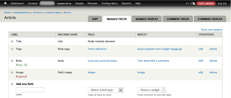
The result looks something like this:

At this point I believe that to make the additional pseudo-row added to the table a more robust thing, capable of wrapping and supporting content of varying height, you would have to involve Javascript in order to - at minimum - manage element heights. I'll leave that as an exercise for the reader.